
Learnify X Webflow Template
Presenting Learnify X, the ultimate Online Education Webflow Template


What is included in Learnify X
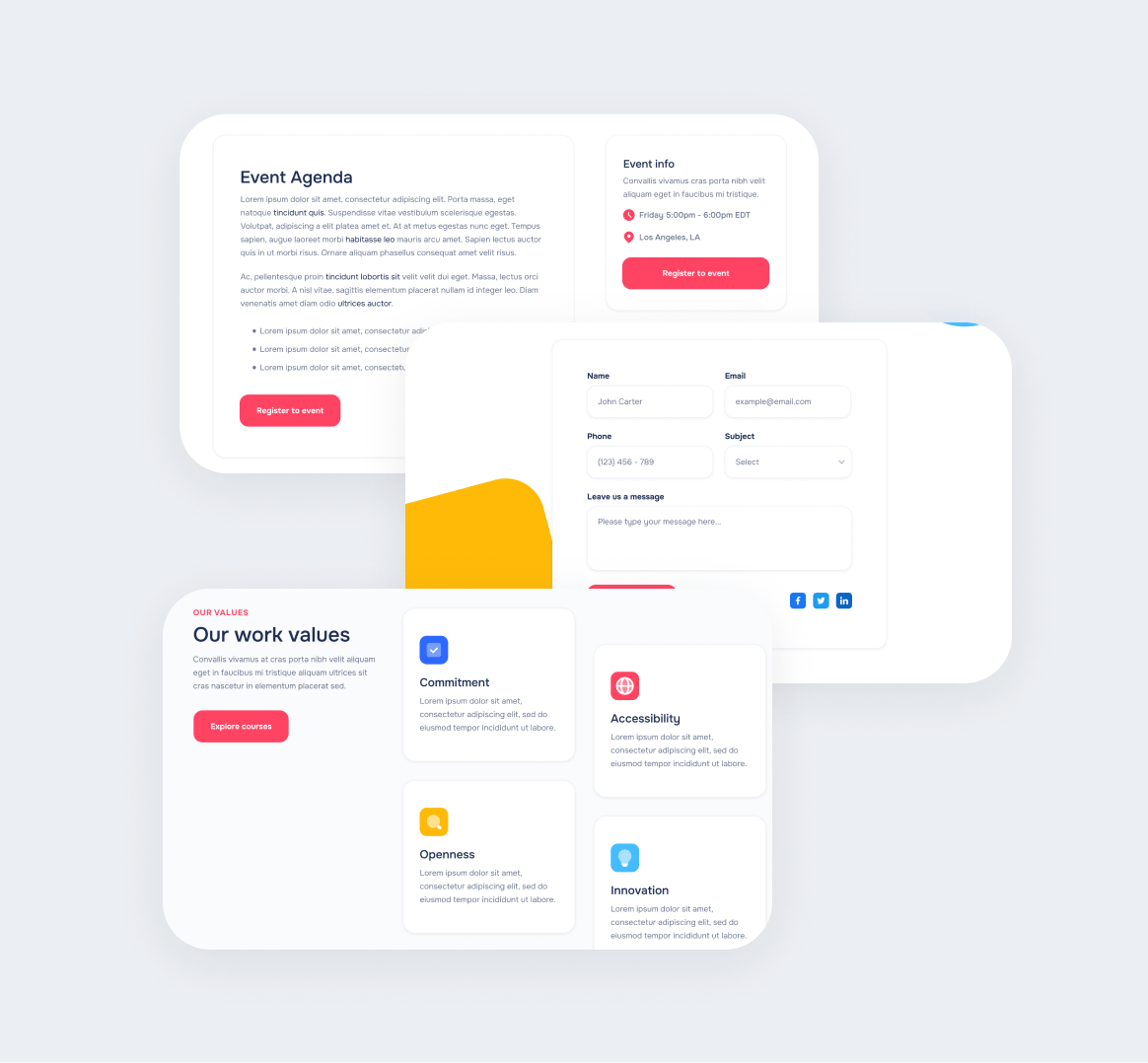
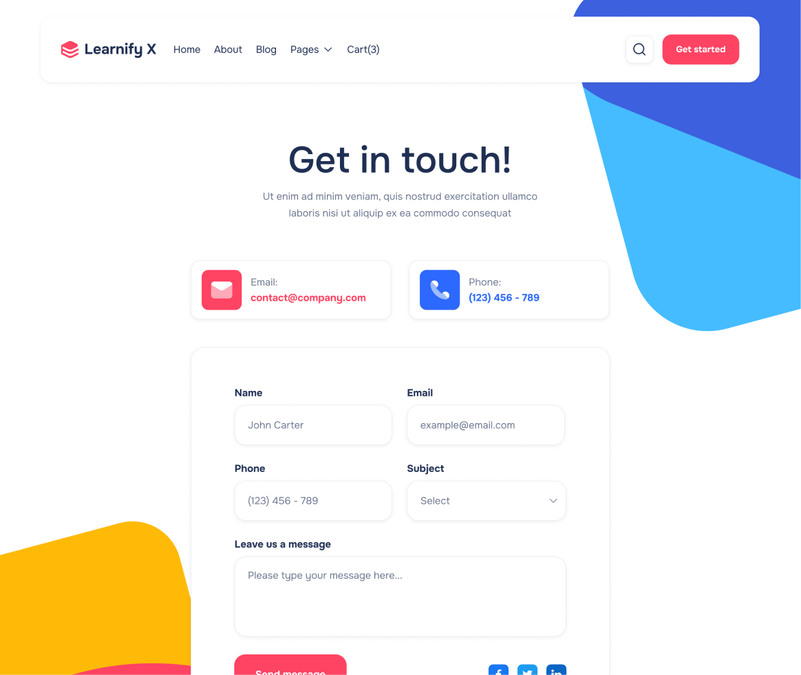
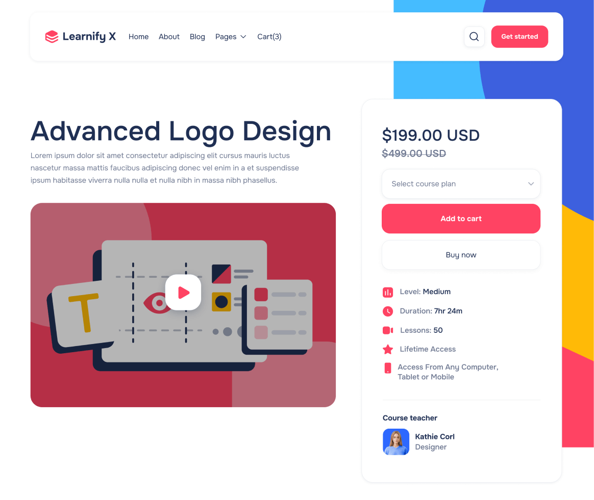
Learnify X Webflow Template includes over 15 pages in total, and with more than 35 sections.


Send us an email to learnifyx@brixtemplates.com with your purchase receipt, and we will send you the editable Figma file for the Learnify X template.
Request Figma file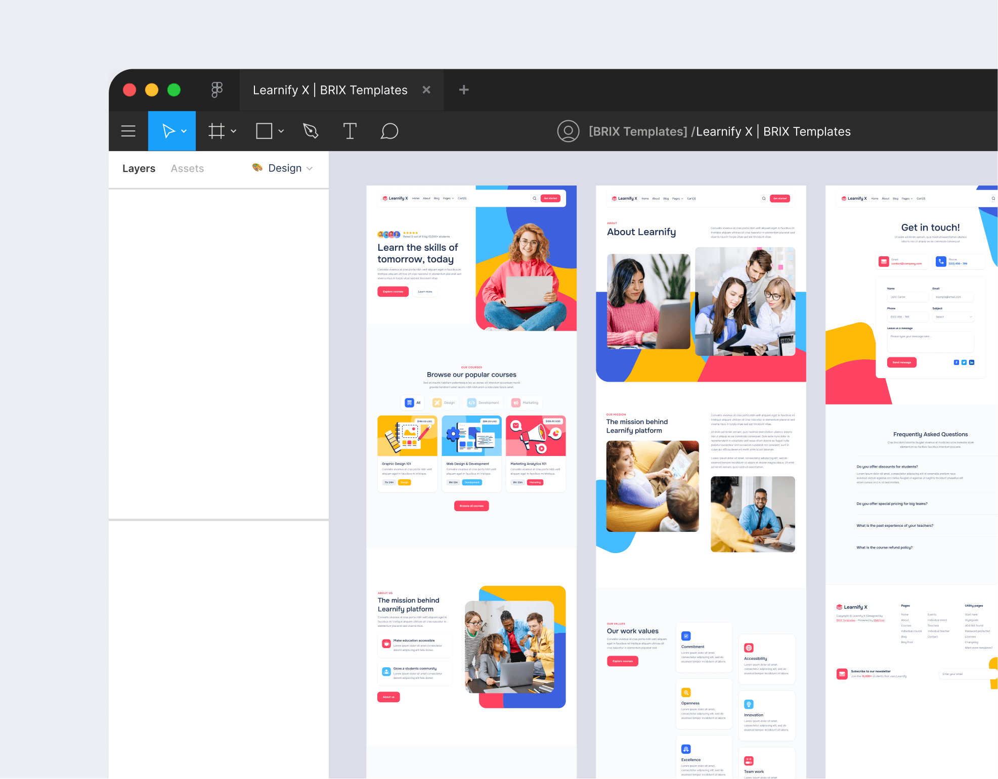

Take a look at our collection of 100+ premium Webflow Templates at BRIX Templates.
Browse TemplatesMain pages
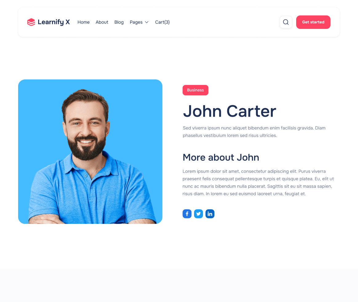
Take a look at the main pages included in the Learnify X Template.


Utility pages
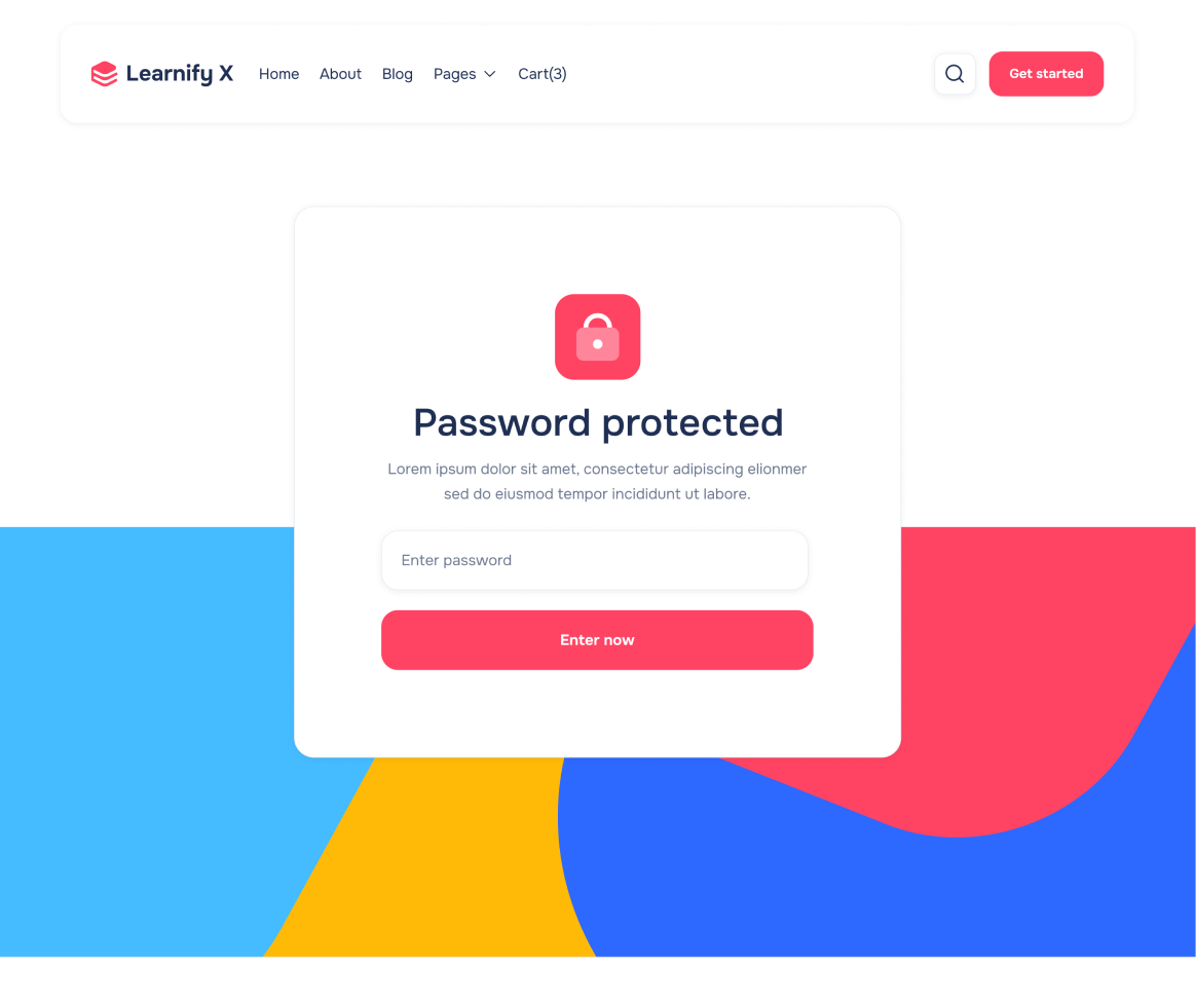
Take a look at the utility pages included in the Learnify X Template.


The Learnify X Webflow Template also comes with more surprises...
3 Headers and Footers
With a total of 3 different headers and footers, you can easily customize the Learnify X Webflow Template to fit your company needs and requirements.
Buy template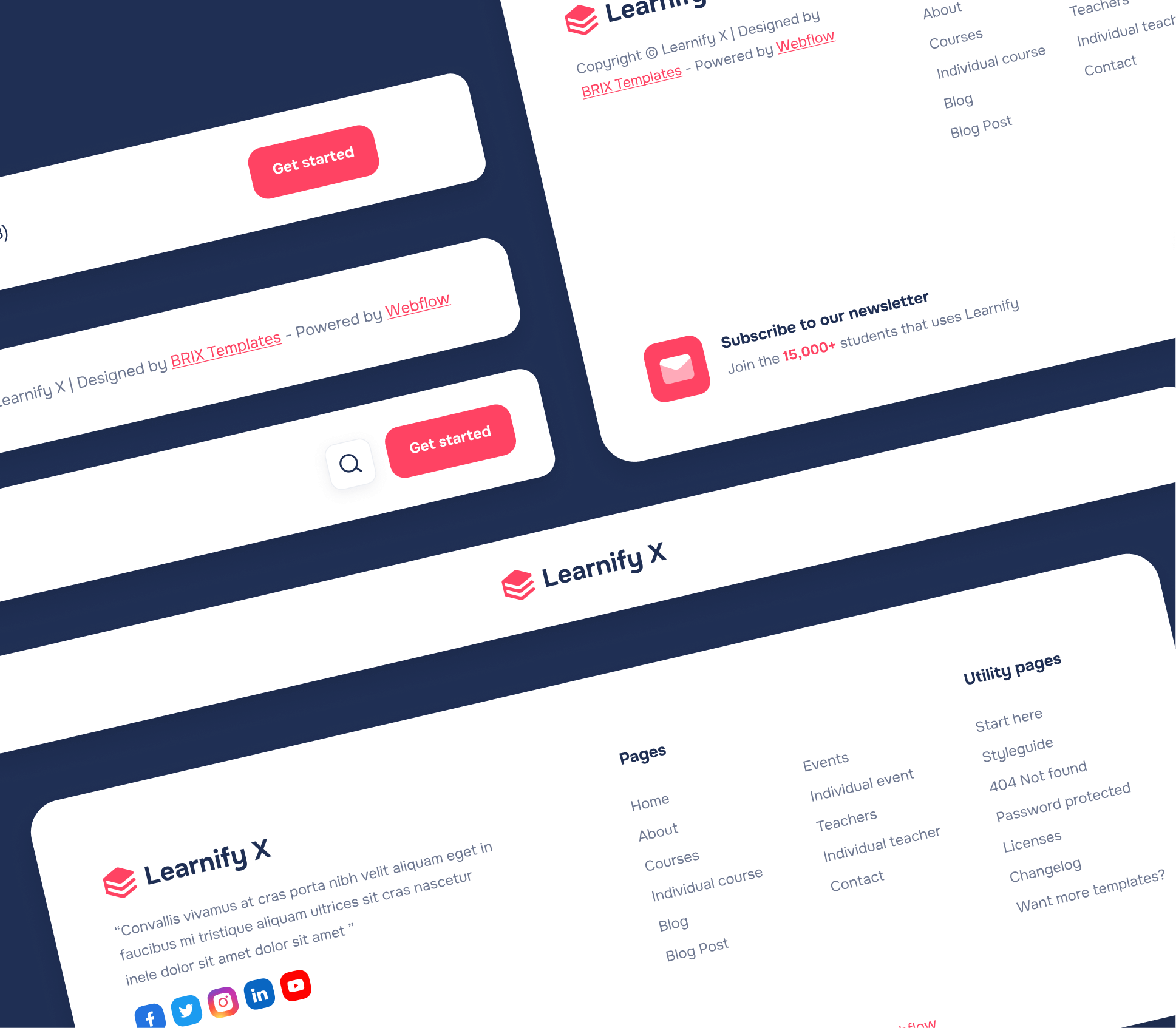
3 Notification Bars
If you are looking to get more sales, use one of our 3 notification bars included in the Learnify X Webflow Template, and start promoting your products or services.
Buy templateCustom Icon Set
The Learnify X Webflow Template includes 3 sets of custom icons (rounded, square and filled), so you can easily use more icon fonts in your template.
No matter if you are looking to add another social media icon in the footer, or change the cart icon in the header, we got you covered.

Social Media Assets
Our Learnify X Webflow Template Figma file includes a collection of social media covers that match with the Webflow Template design (for Facebook, Twitter and LinkedIn), so you can easily edit, customize, and use them for your own social media profiles.
Buy templateEmail Signature
Our Learnify X Webflow Template Figma file includes 2 custom email signature templates that match with the Webflow template, and you can use them to impress your customers with an amazing email signature.
Buy template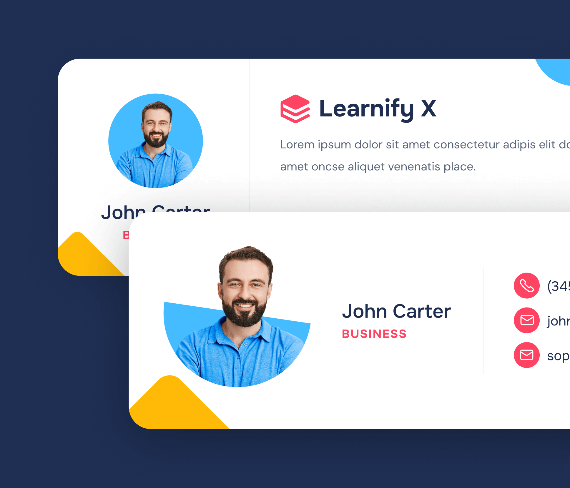

